Colour & Finishes
Choosing Paint Colours for a Calgary Home: Light, Seasons and Undertones
By Franklin SamuelPublished Last updated 5 min read
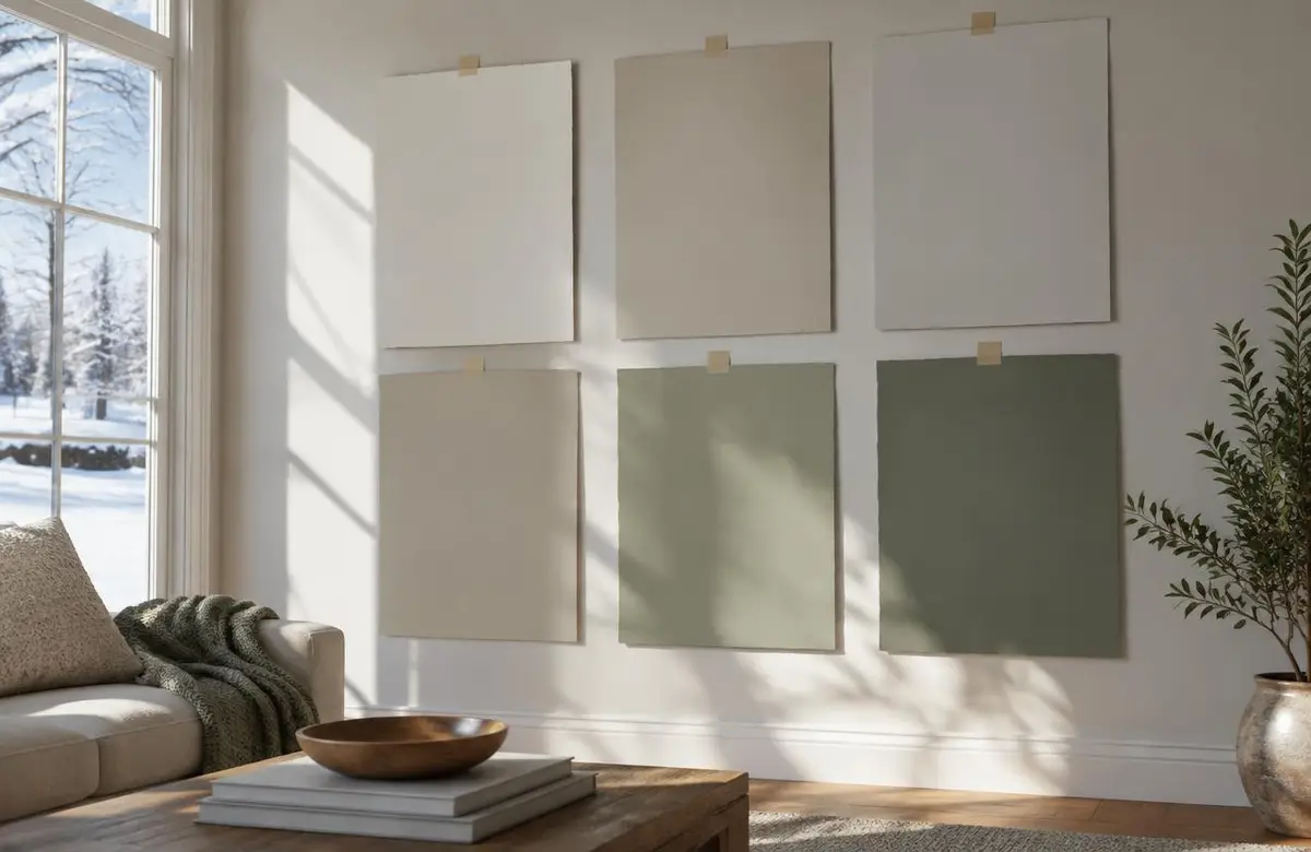
A paint colour can look calm on a small card and surprisingly pink across a living room wall. That does not mean you chose badly. It means the colour is now surrounded by your flooring, furniture and real daylight. Those surroundings change what your eye notices. I like to bring the decision into the house early, before you commit to painting every room.
Calgary gives us plenty to consider. Bright, low-angle winter sun reaches deep into some rooms, and light bouncing off snow changes the light coming through the windows. Long summer evenings give west-facing rooms a different feel. A good colour choice needs to work during ordinary life, not just during one sunny viewing.
How does Calgary light change a wall colour?
In winter, direct sun can reach walls that sit in shade during summer. Snow outside can bounce extra brightness into the room. Nearby brick, siding and fences can also reflect colour through a window. A neutral wall may pick up a cast you did not see on the sample card at the shop.
Summer brings longer daylight hours and a later evening glow. A colour that feels balanced at lunchtime can look much warmer when the setting sun reaches it. I do not chase a colour that looks identical all day. Paint will respond to changing light. I want one that stays comfortable through the changes your room actually experiences.
Your window coverings matter too. Sheer curtains soften daylight, while a covered porch can keep a room shaded even with large windows. Trees leafing out can change the light between seasons. Tell me how you use your blinds and which hours you spend in the room. Testing with everything wide open can miss the conditions you live with most.
What works in north-facing and south-facing rooms?
North-facing rooms usually have cooler, more indirect daylight. A very cool grey or blue-white can feel colder there than expected. A neutral with some warmth may make the room feel more comfortable, but adding lots of yellow is not an automatic fix. It still needs to sit well beside flooring, upholstery and trim.
South-facing rooms often receive stronger, warmer daylight. They can carry a wider range of neutrals, though some warm colours become more golden in direct sun. A cooler white can balance that light, but it may look sharp in adjoining shaded spaces. I look at the connecting hallway as well as the sunny room before recommending a direction.
East-facing rooms change from brighter morning light to quieter afternoon conditions. West-facing rooms often do the reverse, with stronger warmth late in the day. Think about when the room gets used. If your family gathers after supper, the evening sample check deserves more attention than the one you squeezed in before work.
What exactly is an undertone?
An undertone is the quieter colour you notice beneath the main impression. A beige may lean pink or green. A white may carry yellow, blue or violet. These shifts become clearer beside other surfaces. Put two nearly white samples together and the difference often jumps out, even though either one looked plain white by itself.
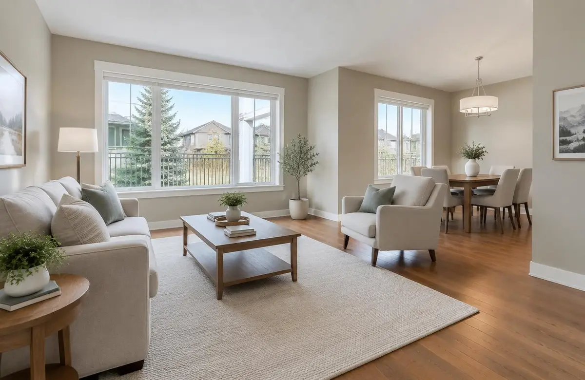
I start with the finishes you are keeping. Flooring, stone counters, tile and a large sofa set useful boundaries. If the floor has a strong warm cast, a cool white might create a contrast you enjoy, or it might make both surfaces feel out of place. The right answer comes from seeing them together, not following a universal rule.
Do not judge every sample against a wall colour you already dislike. A bold existing wall can distort the comparison. Use a neutral surround where possible and compare a short list. Keeping a dozen nearly identical samples in play makes the choice harder. Once you identify the direction that fits the room, remove the ones that clearly fight it.
How should you test sample boards?
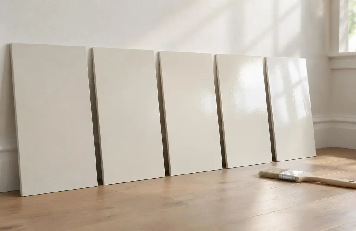
Use large sample boards painted with the colour you are considering. Give the sample enough coats for even coverage and let it dry before judging. Small chips are useful for narrowing options, but they cannot show the feeling of a larger surface. A board also lets you move the same colour without painting patches all around the house.
Place boards against several walls, close to trim and beside the main fixed finishes. Keep them upright, because a sample lying on a table catches light differently. Check them in the morning, afternoon and evening. Turn on the lights you normally use at night. A sample that works only with the ceiling lights off has not passed the whole test.
- Look beside the flooring and kitchen counters, not only beside white paper.
- Check both the brightest wall and a shaded corner.
- View boards from the doorway and from your usual chair.
- Compare colours with curtains and blinds in their normal positions.
- Keep notes about which option feels comfortable at different times.
Should you choose a warm white or a cool white?
Warm whites can work well with wood, cream fabrics and earthy finishes. Some become noticeably creamy beside crisp white cabinets or tile. Cool whites can look clean with cooler materials, yet feel stark beside warm oak. Neither group is automatically more modern or more welcoming. The relationships in your house decide whether the combination works.
Trim deserves its own comparison. Keeping an existing warm trim colour can make a new cool wall colour look different than expected. If you plan to repaint both, test the pair together. For interior painting, I like to settle walls, trim and ceilings as a group so the last decision does not undo the first one.
How do you keep colours flowing through the house?
Stand where you can see several rooms at once. The entry may show the living room, stairwell and kitchen together, even though you think of them as separate projects. A shared neutral can connect those views. Bedrooms or a closed office can have their own colour while still relating to the main palette through similar warmth or depth.
Finish also affects how colour reads. A shinier surface catches light differently from a matte wall, and repairs can interrupt that reflection. My guide to paint finishes explains those choices. If your plan includes woodwork, we can coordinate trim and door painting with the wall colours before work starts.
Bring your shortlist and tell me which rooms are giving you trouble. Call or text 403-861-1963 or request a free estimate. I will help you build a practical colour plan around the home you already have.